Welcome to the Treehouse Community
Want to collaborate on code errors? Have bugs you need feedback on? Looking for an extra set of eyes on your latest project? Get support with fellow developers, designers, and programmers of all backgrounds and skill levels here with the Treehouse Community! While you're at it, check out some resources Treehouse students have shared here.
Looking to learn something new?
Treehouse offers a seven day free trial for new students. Get access to thousands of hours of content and join thousands of Treehouse students and alumni in the community today.
Start your free trial
Jamie Allison
3,358 PointsNav list items are higher on the page, and also stack up slightly upon resizing the window just after the break point!?
So i noticed that after i added the new code to the header, it appears higher on the page than it does on Nicks example. Plus when i resize the page there is a certain point just after the break point where the nav list items stack up and 'contact' appears below 'about'. It's not a firefox issue (which is what i use), as i opened it in explorer too and it does the same thing. My code is exactly the same as Nick's, and i even deleted the code and restarted the video and the same thing happened. Its totally fine and everything looks the same as Nick's right up until I add the 'nav' code: nav { background: none; float: right; font-size: 1.125em; margin-right: 5%; text-align: right; width: 45%; }
I have screenshots of what it does but don't know if i can add them here.
to be clear, it looks fine and works great in small format, but just after it breaks to a larger format the nav text stacks up, and is too high on the page. then after the window is made a fraction larger it fixes the stacking issue, but the text is still to high.
I had thought that the 'inline-block' previously written in main.css would prevent the nav text from stacking when the size is reduced.. or am I missing something?
would appreciate any thoughts or input, or if you need more information, details or certain code to look at just ask..
Thanks in advance!
Marcus Parsons
15,719 PointsHey Jamie Allison,
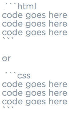
If you'd like to post your full code for the HTML and in a separate code block, your code for the CSS, I am happy to help you. Here is how to post your code, and just be sure to leave blank lines above and below each block of code:


Jamie Allison
3,358 PointsJamie Allison
3,358 PointsOK, so i just fixed the problem that for some reason seemed to click in my head! It was the margin value given to the 'nav ul' in 'main.css'. I removed the margin and it is totally fine now, just like Nicks. I'd still like some more input however because unless i missed Nick deleting the margin, my code should be exactly the same and I'm still unsure as to why that would happen for me and not for him.
Also do you foresee removing this margin value to be an issue further down the line, or see it affecting the website's responsiveness? As far as I can tell all that margin value was doing was pushing the text to stack when the browser was reduced in size and making it hug the top of the webpage. At this point I'm a little unsure as to why it was initially added in the first place! Haha!
Again, any thoughts would be appreciated!