Welcome to the Treehouse Community
Want to collaborate on code errors? Have bugs you need feedback on? Looking for an extra set of eyes on your latest project? Get support with fellow developers, designers, and programmers of all backgrounds and skill levels here with the Treehouse Community! While you're at it, check out some resources Treehouse students have shared here.
Looking to learn something new?
Treehouse offers a seven day free trial for new students. Get access to thousands of hours of content and join thousands of Treehouse students and alumni in the community today.
Start your free trial
joeytou
2,550 PointsMy font size is really small and my pictures doesn't show next to each other side by side. How do i fix this?
<!DOCTYPE html>
<html>
<head>
<meta charset="utf-8">
<title>Joey Tou | Designer</title>
<link rel="stylesheet" href="css/normalize.css">
<link href='http://fonts.googleapis.com/css?family=Domine|Open+Sans:400italic,700italic,400,700,800' rel='stylesheet' type='text/css'>
<link rel="stylesheet" href="css/main.css">
</head>
<body>
<header>
<a href="index.html" id="logo">
<h1>Joey Tou</h1>
<h2>Designer</h2>
</a>
<nav>
<ul>
<li><a href="index.html" class="selected">Portfolio</a></li>
<li><a href="about.html">About</a></li>
<li><a href="contact.html">Contact</a></li>
</ul>
</nav>
</header>
<div id="wrapper">
<section>
<ul id="gallery">
<li>
<a href="img/numbers-01.jpg">
<img src="img/numbers-01.jpg" alt="">
<p> Experimentation with color and texture.</p>
</a>
</li>
<li>
<a href="img/numbers-02.jpg">
<img src="img/numbers-02.jpg" alt="">
<p> Playing with blending modes in Photoshop.</p>
</a>
</li>
<li>
<a href="img/numbers-06.jpg">
<img src="img/numbers-06.jpg" alt="">
<p> Trying to create an 80's style of glows.</p>
</a>
</li>
<li>
<a href="img/numbers-09.jpg">
<img src="img/numbers-09.jpg" alt="">
<p> Drips created using Photoshop brushes.</p>
</a>
</li>
<li>
<a href="img/numbers-12.jpg">
<img src="img/numbers-12.jpg" alt="">
<p> Creating shapes using repetition .</p>
</a>
</li>
</ul>
</section>
<footer>
<a href="https://twitter.com/jo_mamaa_"><img src="img/twitter-wrap.png" alt="Twitter Logo"></a>
<a href="https://www.facebook.com/joey.tou"><img src="img/facebook-wrap.png" alt="Facebook Logo"></a>
<p>© 2014 Joey Tou.</p>
</footer>
</div>
</body>
</html>
/*****************************
GENERAL
*****************************/

body{
  font-family: 'Open Sans', sans-serif;
}

#wrapper {
  max-width: 940px;
  margin: 0 auto;
  padding: 0 5%;
}

a {
  text-decoration:none;
}

img{
 max-width: 100%;
}


/*****************************
HEADING
*****************************/

#logo{
  text-align: center;
  margin: 0;
}

h1{
  font-family: 'Domine', sans-serif;
  margin: 15px 0;
  font-size: 1.75em;
  font-weight: normal;
  line-height: 0.8em;
}

h2{
  font-size: 0.75em;
  margin: -5px 0 0;
  font-weight: normal;
}


/*****************************
NAVIGATION
*****************************/

nav{
  text-align: center;
  padding: 10px 0;
  margin: 20px 0 0;
}


/*****************************
FOOTER
*****************************/

footer{
  font-size: 0.75em;
  text-align: center;
  padding-top: 50px;
  color: #ccc;
}


/*****************************
Page: Portfolio
*****************************/

#gallery{
  margin: 0;
  padding: 0;
  list-style: none;
}

#gallery li{
  float: left;
  width 45%;
  margin: 2.5%;
  background-color: #f5f5f5;
  color: #bdc3c7;
}

#gallery li a p{
  margin: 0;
  padding: 5%;
  font-size: 0.5em;
  color: #bdc3c7;
}


/*****************************
COLOR
*****************************/

/* site body */
body{
  background-color: #fff;
  color: #999;
}

/* green header */
header{
  background: #6ab47b;
  border-color: #599a68;
}

/* nav background on mobile */
nav{
 background: #599a68;
}

/* logo text */
h1, h2 {
  color: #fff;
}

/* links */
a{
 color: #6ab47b;
}

/* nav link*/
nav a, nav a:visited{
   color: #fff;
}

/* selected nav link */
nav a.selected, nav a:hover {
   color: #32673f;
}
My Photo isnt sitting side by side like what it shows in the video. And after I did the 0.5em for the font size of the caption it ends up being really small. You can't even read the words.
Marcus Parsons
15,719 PointsHey joeytou,
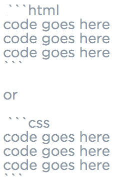
Here is how to post your code on the forums (be sure to leave blank spaces above and below code blocks):
And Ben Dietrich, you should save those images. They'll save you some time and explanations later on haha
Ben Dietrich
8,287 PointsThanks Marcus Parsons. Was thinking there had to be a better way! Also, nice work on becoming a moderator. Impressive!
Marcus Parsons
15,719 PointsAnytime, Ben Dietrich! I appreciate it. Having this moderator status will help when it comes to editing others' markdown so that I don't have to tag a random mod and hope they do it lol
2 Answers
wuworkshop
3,429 PointsI don't know about the font size issue, but you have a syntax mistake in your CSS that will fix the images not being side by side. Under your Page: Portfolio section, you're missing a colon for the width property in your #gallery li block. It should be:
#gallery li{
  float: left;
  width: 45%;
  margin: 2.5%;
  background-color: #f5f5f5;
  color: #bdc3c7;
}
joeytou
2,550 PointsLol I got it now thanks. I was looking at it for like a min.
shezazr
8,275 PointsI am not 100% sure but since you are using font-size: 1.75em; ems.. maybe try setting a default font-size on the body { } tag something like font-size:2em so that other tags inside have something to go by..
one other problem I can see is that you have a whole CSS in one file.. you have h1, h2.. at the top for one page but then you are changing some of css styling later down the line.. this means those styling will be kept for the page above.. as well
e.g.
/** home page ***/
body {
 color: #fff;
}

/** somewhere down the css */
/** contact page ***/
body {
 color: red;
}

Now homepage will also be red.. I would keep all h1 settings together OR create separate css files..
joeytou
2,550 PointsYea I was following the video they did it like that so I just followed along.


Ben Dietrich
8,287 PointsBen Dietrich
8,287 Pointsjoeytou,
Can you repost your css using markdown? From what you've added I cannot determine if you've properly called certain selectors, like #wrapper or #gallery.
Use the same sytnax that you did for the HTML, swapping in css for html. Thanks!