Welcome to the Treehouse Community
Want to collaborate on code errors? Have bugs you need feedback on? Looking for an extra set of eyes on your latest project? Get support with fellow developers, designers, and programmers of all backgrounds and skill levels here with the Treehouse Community! While you're at it, check out some resources Treehouse students have shared here.
Looking to learn something new?
Treehouse offers a seven day free trial for new students. Get access to thousands of hours of content and join thousands of Treehouse students and alumni in the community today.
Start your free trial
Kit Howlett
2,428 PointsGallery Position Problem... Column not working as expected after float
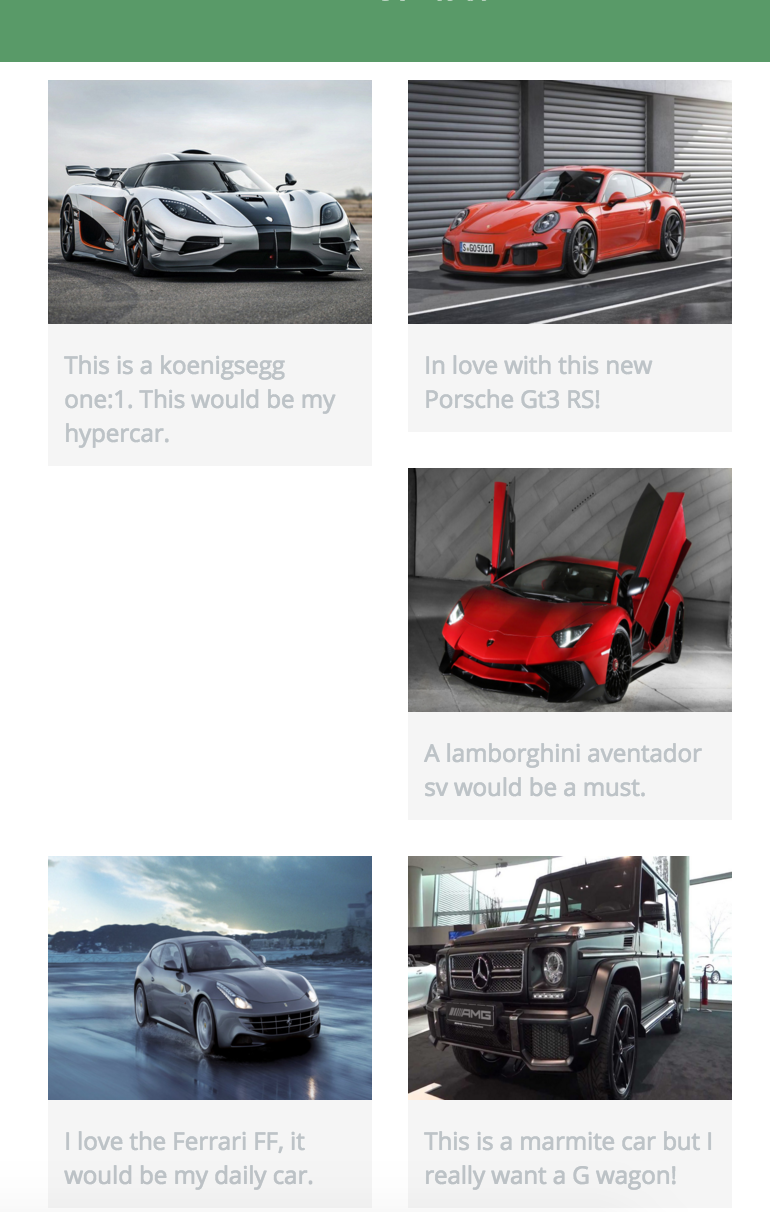
Hi, I cant seem to work out why one of my images is being pushed all over to the right and not sitting underneath the other one. I have a feeling its because the text in the text box is going into three lines in the first image which means it wont sit underneath the first image property and is therefore sitting under the second image.
I have tried to add a screenshot which I put on imgur.
Is there someone who could help me fix this issue?
This is my code
<!DOCTYPE html>
<html>
<head>
<meta charset="utf-8">
<title>Kit Howlett | Dream Garage</title>
<link rel="stylesheet" href="css/normalize.css">
<link href='https://fonts.googleapis.com/css?family=Changa+One|Open+Sans:400,400italic,700,700italic,800' rel='stylesheet' type='text/css'>
<link rel="stylesheet" href="css/main.css">
</head>
<body>
<header>
<a href="index.html" id="logo">
<h1>Kit Howlett</h1>
<h2>Dream Garage</h2>
</a>
<nav>
<ul>
<li><a href="index.html" class="selected">Garage</a></li>
<li><a href="about.html">About</a></li>
<li><a href="contact.html">Contact</a></li>
</ul>
</nav>
</header>
<div id="wrapper">
<section>
<ul id="gallery">
<li>
<a href="img/car1.jpeg">
<img src="img/car1.jpeg" alt="">
<p>This is a koenigsegg one:1. This would be my hypercar. </p>
</a>
</li>
<li>
<a href="img/car2.jpeg">
<img src="img/car2.jpeg" alt="">
<p>In love with this new Porsche Gt3 RS!</p>
</a>
</li>
<li>
<a href="img/car3.jpeg">
<img src="img/car3.jpeg" alt="">
<p>A lamborghini aventador sv would be a must.</p>
</a>
</li>
<li>
<a href="img/car4.jpeg">
<img src="img/car4.jpeg" alt="">
<p>I love the Ferrari FF, it would be my daily car.</p>
</a>
</li>
<li>
<a href="img/car5.jpeg">
<img src="img/car5.jpeg" alt="">
<p>This is a marmite car but I really want a G wagon!</p>
</a>
</li>
</ul>
</section>
<footer>
<a href="https://twitter.com/kit_howlett"><img src="img/twitter-wrap.png" alt="Twitter Logo"></a>
<a href="https://www.facebook.com/kit.howlett"><img src="img/facebook-wrap.png" alt="Facebook Logo"></a>
<p>© 2016 Kit Howlett.</p>
</footer>
</div>
</body>
</html>
```
```css
/*********************
GENERAL
*********************/
body {
font-family: 'Open Sans', sans-serif;
}
#wrapper {
max-width: 940px;
margin: 0 auto;
padding: 0 5%;
}
a {
text-decoration: none;
}
img {
max-width: 100%;
}
/*********************
HEADING
*********************/
#logo {
text-align: center;
margin: 0;
}
h1 {
font-family: 'Changa One', sans-serif;
margin: 15px 0;
font-size: 1.75em;
font-weight: normal;
line-height: 0.8em;
}
h2 {
font-size: 0.75em;
margin: -5px 0 0;
font-weight: normal;
}
/*********************
NAVIGATION
*********************/
nav {
text-align: center;
padding: 10px 0;
margin: 20px 0 0;
}
/*********************
FOOTER
*********************/
footer {
font-size: 0.75em;
text-align: center;
clear: both;
padding-top: 50px;
color: #ccc;
}
/*********************
Gallery
*********************/
#gallery {
margin: 0;
padding: 0;
list-style: none;
}
#gallery li{
float: left;
width: 45%;
margin: 2.5%;
background-color: #f5f5f5;
color: #bdc3c7;
}
#gallery li a p {
margin: 0;
padding: 5%;
font-size: 0.75em;
color: #bdc3c7;
}
/*********************
COLORS
*********************/
/*Site Body*/
body {
background: #fff;
color: #999;
}
/* Green Header */
header {
background: #6ab47b;
border-color: #599a68;
}
/* Nav Background on Mobile Devices */
nav {
background: #599a68;
}
/* Logo Text */
h1,h2 {
color: #fff;
}
/* Links */
a {
color: #6ab47b;
}
/* Nav Links */
nav a, nav a:visited {
color: #fff;
}
/* Selected Nav Link */
nav a.selected, nav a:hover {
color: #32673f;
}
Thanks!
3 Answers
Jake Lundberg
13,965 PointsYou are correct, it is because the text for your first car is causing the element to become taller than the element next to it, breaking your layout. When I have encountered this, I have done 1 of 2 things...
Solution 1: specifically set the height of each li container so that all your elements remain the same height. The downside to this is that you could either end up with overflow (the text spilling out of the element), or some dead/white space at the bottom of the element.
Solution 2: use :nth-child() pseudo class to float your odd elements left, and your even elements right...example:
#gallery li:nth-child(odd) {
   float: left;
   //other styles
}

#gallery li:nth-child(even) {
   float: right;
   //other styles
}
the downside to using this is that it only works with a 2 column layout, and you elements will not display aligned horizontally.
There may be other solutions, but these are what I have done before to fix things like this.
Hope this helps!
Kit Howlett
2,428 PointsOh I understand now, thank you for explaining!
Kit Howlett
2,428 PointsOh I understand now, thank you for explaining!

Kit Howlett
2,428 PointsKit Howlett
2,428 PointsThank you very much for your reply! I may try the first option you gave me as I don't mind the white space. Are you able to explain your second option in a bit more detail as in how it would work?
Thank you!
Jake Lundberg
13,965 PointsJake Lundberg
13,965 PointsFor the second solution, look into :nth-child() pseudo class (MDN is a great source) for a deeper understanding, but basically, this allows you to select only certain elements for styles to be applied. For instance, say you only wanted some style to be applied to every 4th element somewhere in your web app, you could use nth-child() to do that. In this case, you apply one style to only the odd number elements (the 1st, 3rd, 5th, etc li elements in this case) because these are the elements that will always be on the left hand side in a 2 column layout. And another style to your even number elements (the 2nd, 4th, 6th, etc li elements) because these are the elements that will always be on the right side of a two column layout. Does that make sense?