Welcome to the Treehouse Community
Want to collaborate on code errors? Have bugs you need feedback on? Looking for an extra set of eyes on your latest project? Get support with fellow developers, designers, and programmers of all backgrounds and skill levels here with the Treehouse Community! While you're at it, check out some resources Treehouse students have shared here.
Looking to learn something new?
Treehouse offers a seven day free trial for new students. Get access to thousands of hours of content and join thousands of Treehouse students and alumni in the community today.
Start your free trial
Jason Rich
Front End Web Development Techdegree Student 10,048 PointsCan we really trust Chrome Dev Tools for mobile first responsiveness?
EDIT:
So, after messing around with it, I finally saw it being replicated in Firefox Dev Tools. It seemed like the fieldset is what was expanding the form beyond the viewport. I tried display: contents and it fixed the issue, both in the Dev Tools and after pushing to GitHub Pages and viewing on the phone.
Original question below if someone else runs into this.
========================================================================
I keep running into this issue. How am I supposed to trust what the Dev Tools is showing me when it comes to sizing responsiveness?
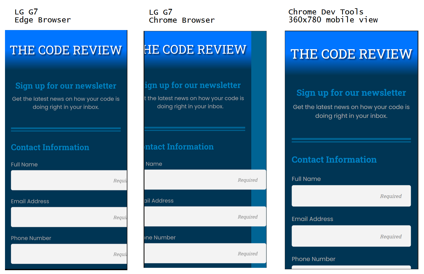
Here is a comparison of my FEWD Project 3 on my LG G7 vs Chrome Dev Tools on my Desktop. The Edge and Chrome are same, I just scrolled screen to left for Chrome screenshot.
LG G7 viewport size is 360x780. My wife has the same phone and the project behaves as it should in her mobile Chrome Browser. Phone and browsers are all up-to-date. I don't have any Accessibility settings, like Text Zoom, on. I've rebooted my phone, opened the site in Incognito windows, nothing seems to be working.
How can I trust what I'm building in Dev Tools to display properly on my phone or a potential employer's phone? Tomorrow, it all may be working fine again.
I don't know and Stack Overflow doesn't seem to know either.
