Well done!
You have completed UX Design Patterns!
You have completed UX Design Patterns!
Deceptive Patterns
So far in this course, we’ve learned about design patterns with a positive impact. The patterns we’ve covered so far help users orient themselves and reduce cognitive load when making decisions on your website or app.
However, it’s important to note that not all design patterns work to the user’s benefit. In 2010, a product designer and UX researcher named Harry Brignull coined the term dark patterns to describe interactions designed to trick users into doing something they don’t want to do. If a user finds themselves accidentally signed up for a mailing list, or can’t figure out how to unsubscribe from a service, a deceptive pattern is likely to blame.
Harry has since joined forces with legal scholars and changed the term to Deceptive patterns. The Deceptive Patterns website has two goals:
To spread awareness about companies that use deceptive patterns
To help users defend themselves by recognizing deceptive patterns
Brignull lists categories of deceptive patterns on his website. By familiarizing themselves with this ever-growing list of deceptive patterns, designers can make more ethical choices and persuade design teams from implementing these harmful practices.
Trick Questions
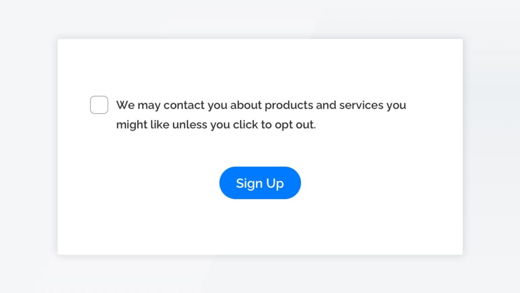
During this course, we learned that users spend far more time scanning than reading. The Trick Question deceptive pattern takes advantage of this tendency by presenting text that appears to mean one thing at a glance but means the opposite when read carefully.
In the above example, the wording of the first half of the sentence suggests this checkbox is used to sign up for the mailing list. However, leaving the box unchecked actually signs up the user.
Sneak Into Basket
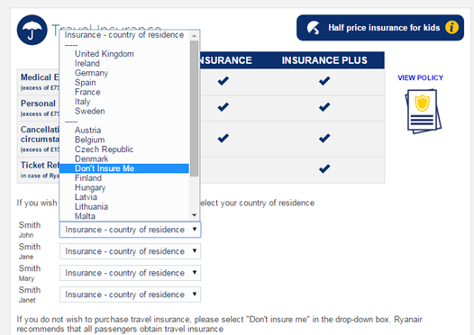
This deceptive pattern happens when an e-commerce site sneaks an additional product or service into your shopping cart.
In the above example, RyanAir automatically adds travel insurance to the user’s selected flight, and users are forced to find the Don’t Insure Me option from the Country of Residence dropdown to decline coverage.
This deceptive pattern is now illegal in the UK and European Union thanks to the Consumer Protection Policy.
Roach Motel
This deceptive pattern describes an online situation (such as subscribing to a mailing list) that’s easy to get into, but hard to escape from.
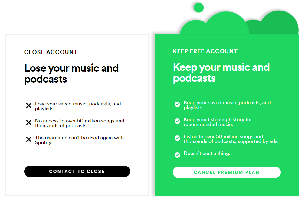
While Spotify includes options to sign up with Google, Facebook, or Apple to make registration as seamless as possible, unsubscribing is a six-step process involving completing multiple forms.
Privacy Zuckering
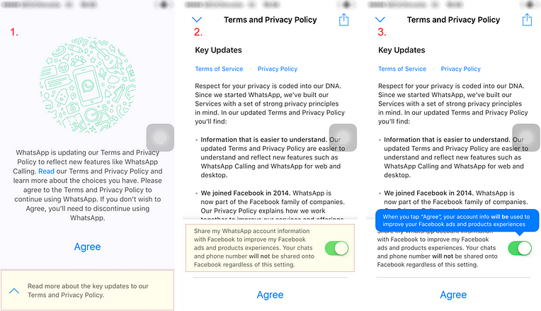
Named after Facebook CEO Mark Zuckerberg, this deceptive pattern involves tricking people into publicly sharing more personal information than intended.
This typically happens thanks to complex and obscure privacy policies, such as the WhatsApp privacy policy shown above. Without scrolling down and reading carefully, users are unaware their WhatsApp account data is being shared with Facebook for advertising purposes.
Price Comparison Prevention and Hidden Costs
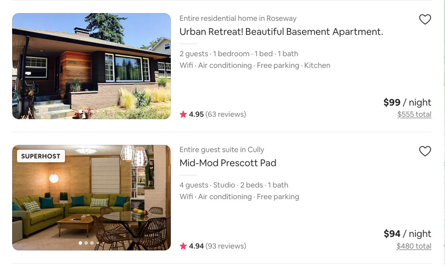
These two similar-sounding deceptive patterns both make it difficult for users to make an informed decision about the cost of an item.
In the Price Comparison Prevention pattern, retailers make it difficult to compare the cost of two different items directly.
In the Hidden Costs pattern, unexpected charges reveal themselves at various points in the shopping process.
When users filter Airbnb search results by price, for example, additional fees are not factored into the search results, meaning two seemingly similar results could vary greatly in total cost.
Misdirection
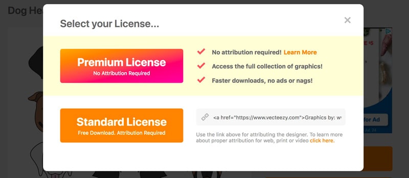
The Misdirection pattern occurs when websites purposely focus your attention on one place to distract your attention from another. A common example is when websites make an expensive product or service look more visually appealing than a free or reduced-cost option.
Bait and Switch
Users set out to accomplish one thing, but something opposite and undesirable happens instead.
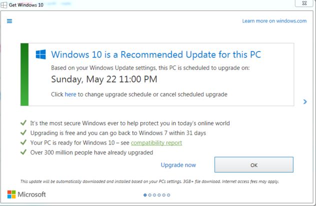
The best-known example is Microsoft’s attempt to convince users to upgrade their operating system to Windows 10. Clicking the X icon in the upper right corner, an action that typically means “Close” or “Exit”, initialized the upgrade process.
Confirmshaming
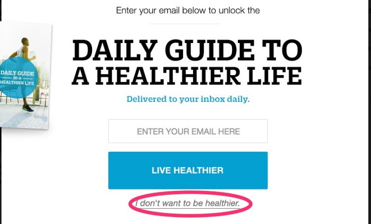
Confirmshaming uses guilt to convince users to opt in for something.
In the above modal, not only is the decline option hard to find, the link uses negative wording to shame the user for refusing to sign up.
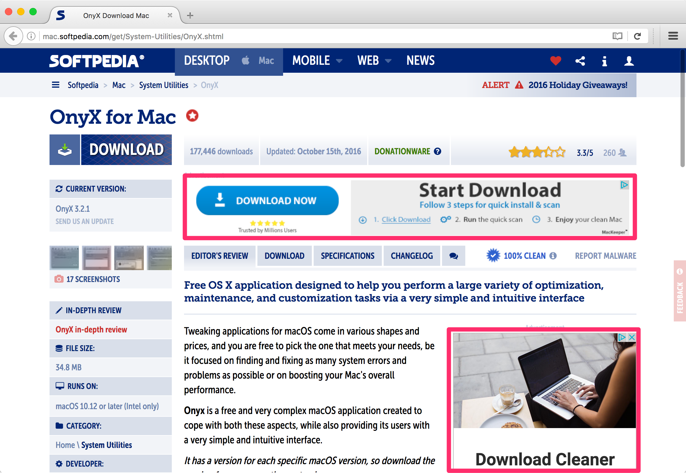
Disguised Ads
Disguised ads are advertisements designed to look like web content or navigation.
In the above example from Yahoo!, advertisements have been designed to perfectly mimic news articles.
Forced Continuity
Forced continuity is when a user supplies payment information for a free trial or service and the supplier hides the ‘subscription renews automatically’ info or makes it difficult to cancel the automatic renewal.
Friend Spam
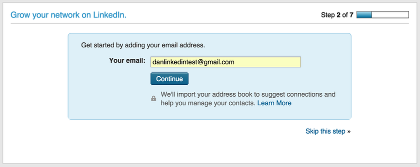
A product asks permission to access your address book, then sends spam messages to your contacts.
In 2015, LinkedIn was fined $13 million dollars as part of a class-action lawsuit by users who signed up for LinkedIn’s “Add Connections” feature. After users signed up, LinkedIn sent “Join LinkedIn” emails to every contact in their network who wasn’t already a LinkedIn member.
Further reading
Deceptive Patterns for an ever-growing list of deceptive patterns
Dark patterns, the tricks websites use to make you say yes, explained
Dark patterns in UX: how designers should be responsible for their actions
